This page controls the components used throughout the IDE, like buttons, scrollbars, etc.
Old Material Design style
This feature is available in the free plan.
This setting reverts the components to the previous Material Design style of 2016, for those who prefer it over the new Material Design style.
Please note: this style remains deprecated, e.g., it won’t be getting any new features neither fixes for issues that can occur within this design.
This feature has been available since 6.15.0
Uppercase buttons
This feature is available in the free plan.
This setting sets the text of the buttons to be uppercase, just like the Material Design buttons. It’s optimal for a full-fledged Material Design experience.
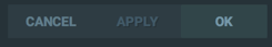
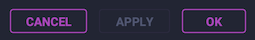
Outline buttons
This feature is only available for premium users.
Starting from version 6.2, this setting replaces regular buttons with outlined buttons.
Transparent scrollbars and accent scrollbars
This feature is available in the free plan.
These options control the appearance of the scrollbars.
Note: this feature works natively on Windows and Linux, but on macOS it’s dependent on the “System Scrollbars” setting.
-
Transparent scrollbars adds more transparency to the scrollbars and set it as the same color as the current theme’s background color. It’s adding 50% opacity, and there is no way to change it.
-
Accent scrollbars replaces the scrollbar color with the current accent color.

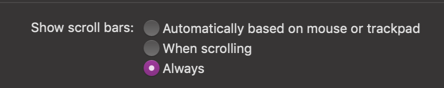
Editor scrollbars
This feature is available in the free plan.
Since 2019.1 the scrollbars enter into two categories:
- UI Scrollbars: these are the scrollbars found throughout the UI, such as lists and trees.
- Editor Scrollbars: these are scrollbars for the editor.
Due to this separation, this setting only affects the UI Scrollbars.
The Editor Scrollbars, in turn, are managed via a Color Scheme Setting Page.
Tabs shadow
This feature is available in the free plan.
This option enables/disables the shadow under the tabs.
Shadows
This feature is only available for premium users.
This small tweak adds a shadow to popups and some notifications.
Inverted completion selection color
This feature is available in the free plan.
This setting allows you to choose between two styles for the selected option in the Autocomplete Panel:
Animated Tool Windows
This feature is available in the free plan.
This setting allows you to animate the undocked tool windows when they are opening/closing.
It uses the registry feature behind the scenes, so it’s available in the free plans. However, it is disabled on Linux as the animation is not smooth on this platform.
Important: Since the animations only show for undocked tool windows, the plugin will ask you if you want to undock all currently opened tool windows. However, if you change your mind, an action “Dock” is available in the Material Theme Toolbar to dock back the tool windows.