Configure the main settings of the plugin, such as the theme, contrast mode and accent color.
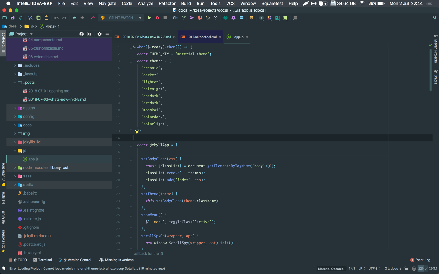
Selected theme
This dropdown allows you to change the currently selected theme just like the Quick Switcher.
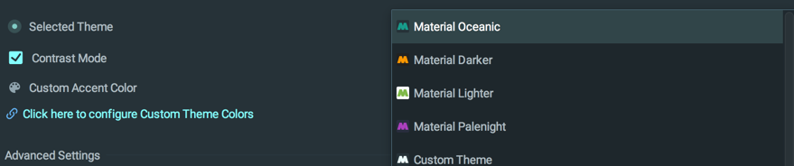
Note that Native Themes won’t show up in this list.
Contrast mode
This feature is available in the free plan.
The contrast mode allows you to add more contrast between the IDE’s panels and components for better visualization.
The parts that are affected by the contrast change are:
- The project tree
- The settings tree
- Inactive tabs
- Input, Search and number controls
- Dropdowns
- Lists and Tables
- etc…
Color palette
High contrast
This feature is only available for premium users.
This option increases the contrast between the editor and the IDE, just like other editors such as Visual Studio Code or Atom.
There is already a Contrast Mode, which is providing contrast between different panes of the editor, such as the Trees or the inputs, but this feature increases the contrast between the IDE itself and the editor. You can even set High Contrast when in Contrast Mode!
The High Contrast mode is setting the main background color and contrast color darker, while setting the primary text color brighter, and vice-versa for light themes. Other colors, such as the main foreground colors or button colors are left unchanged.
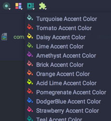
Custom accent color
This feature is available in the free plan.
This setting controls the current accent color used throughout the app.
Accent color is used in many components, such as:
- Quick documentation
- Parameter Info
- Links and bold texts in documentation panels
- Text, number and password boxes border
- Dropdowns border
- Checkboxes and Radio Buttons fill color
- etc…
While a set of predefined accent colors is available in the Accent Color Chooser, this setting allows you to set your own custom color.
Override Accent Color
From version 2.6.0 there is a possibility to override the custom accent color with the default one bundled with the theme. For instance, Material Oceanic’s accent color is a kind of teal, whereas Material Darker’s is orange.
This is especially useful for external themes, so that Themes designers can provide their own accent color.
Notes
- Contrast color is also used inside the striped tables.
- The Override Accent Color from Theme setting takes precedence over the selected accent color.