What’s new in Material Theme UI v9.0.0
Hello everyone, welcome for a new round of Material Theme UI updates. First, I would like to apologize for the lateness in updating the documentation since the latest version, this year has been very rough for me, but after long months of work, the new version is here, albeit still in its early phases, so bugs and performance issues can still be experienced at this point, but hopefully they will be less and less as time goes on.
So what’s new in tow?
New Settings
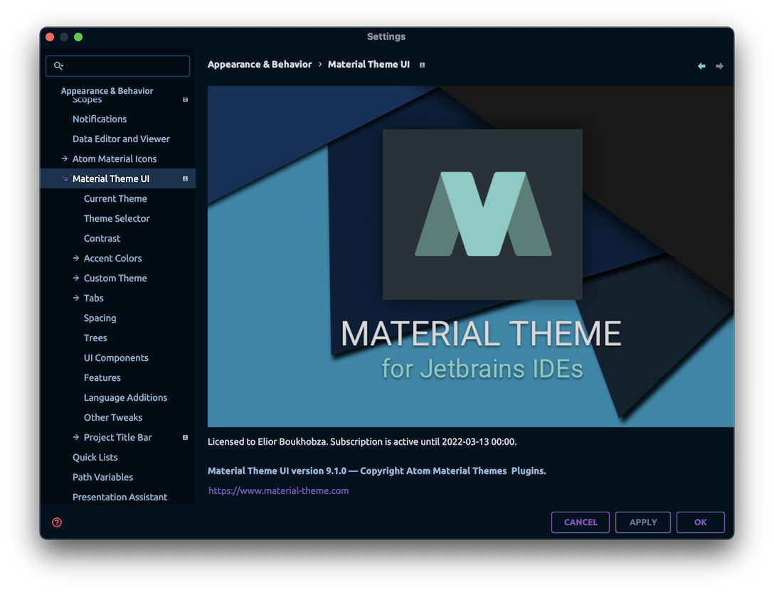
The first thing you will notice is the new settings page. This is a complete overhaul of the settings page, which was long overdue. Since the beginning of the plugin, there has been only two settings overhauls, the last one going as far back as 2017 (!). Back then, the settings were organized into tabs, each tab responsible for a specific part of the plugin.
This was a good idea at the time, but as the plugin grew, so did the settings, and it started to become cramped in there, and it began being difficult to add more settings without breaking the UI.
This is why the new settings page is now organized into different pages, each page representating what was once inside a tab. This makes it easier to find the setting you are looking for, and it also makes it easier to add new settings in the future.
The new settings page is more organized, more intuitive, and using a different technology: Kotlin UI DSL rather than pure Swing. This makes it easier to maintain and to add new features in the future.
As a result of that change, the settings need to be migrated to a new format, as such, the new settings are to be found in a file named material_theme_new.xml as opposed as the previous material_theme.xml. Therefore, you will need to migrate your previous configuration before using the plugin. This is a one-time operation, and you will be prompted to do so when you first open the IDE after updating the plugin.
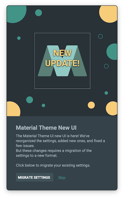
Upon clicking migrate, your previous settings will be migrated to the new format, and you will be able to use the plugin as usual.
Note: You can still re-run the migration process manually through the Actions > Material Theme Features > Migrate Settings.
Centered Editor
Perhaps the most controversial of the changes, is a new feature called Centered Editor. When enabled, it centers the code in the middle of the editor, as opposed as tucked to the left.
This feature is based on the already available Zen Mode of the IDE, found in Menu > View > Appearance > Zen Mode. But, unlike Zen Mode, which also hides all tool windows and tabs, the Centered Editor only centers the code, leaving the rest of the UI intact.
This is particularly pleasant for people working with the Tool Windows closed, or having the Tool Windows undocked, and is similar to the way pages are laid out in the modern web.
You can find the setting under Material Theme UI > Features > Centered Editor
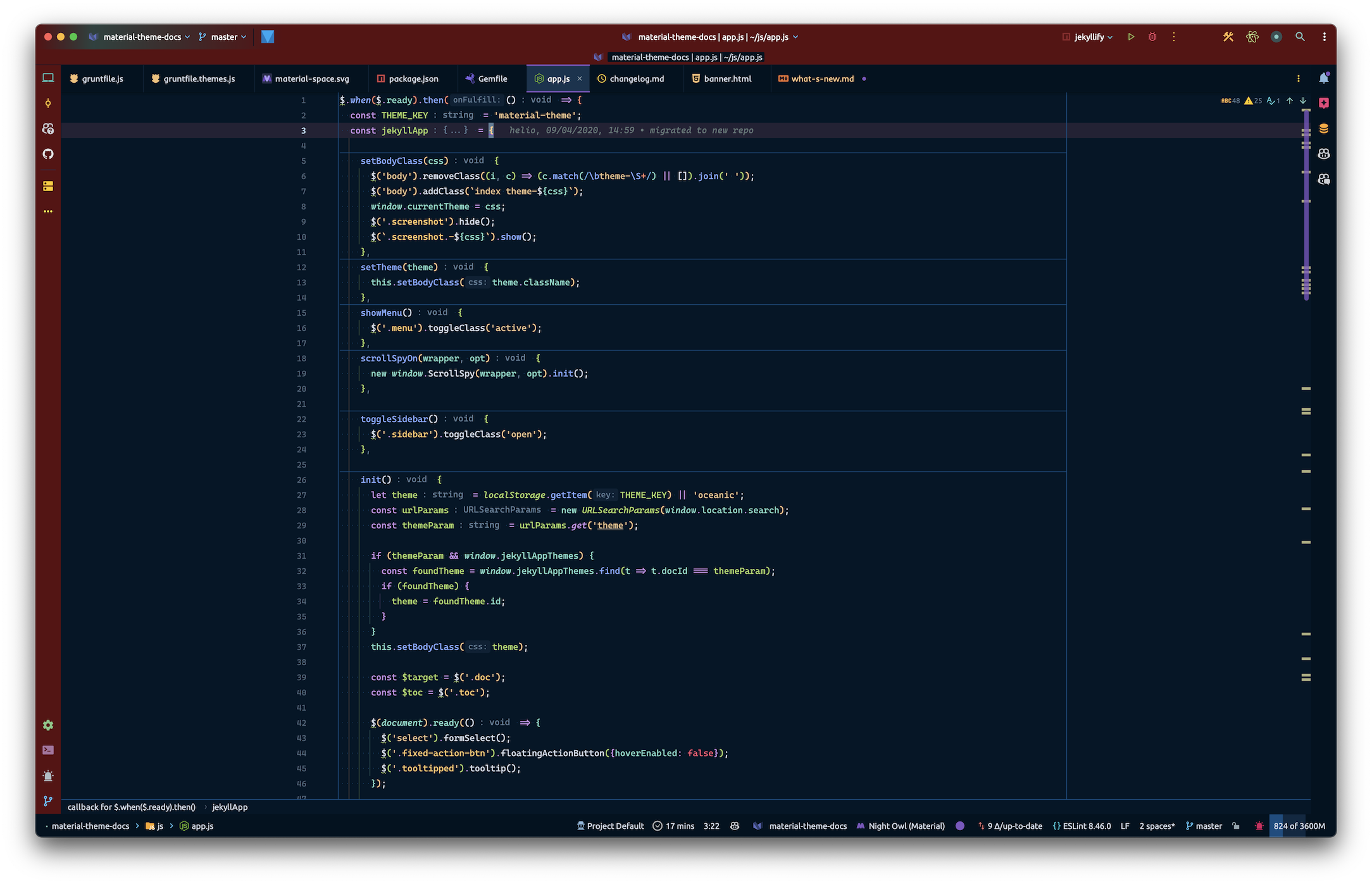
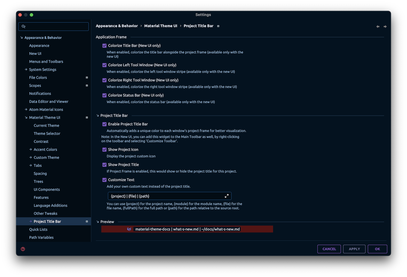
Project Title Bar
Previously named Project Frame, the Project Title Bar sports more options than ever before. For one, it now allows you to control more elements of the screen, namely the Tool Windows and the Status Bar!
Such options allow you to colorize not only the title bar, but the tool windows and the status bar as well, giving you a more “framed” look of your IDE, similar to the famous VSCode “Peacock” extension.
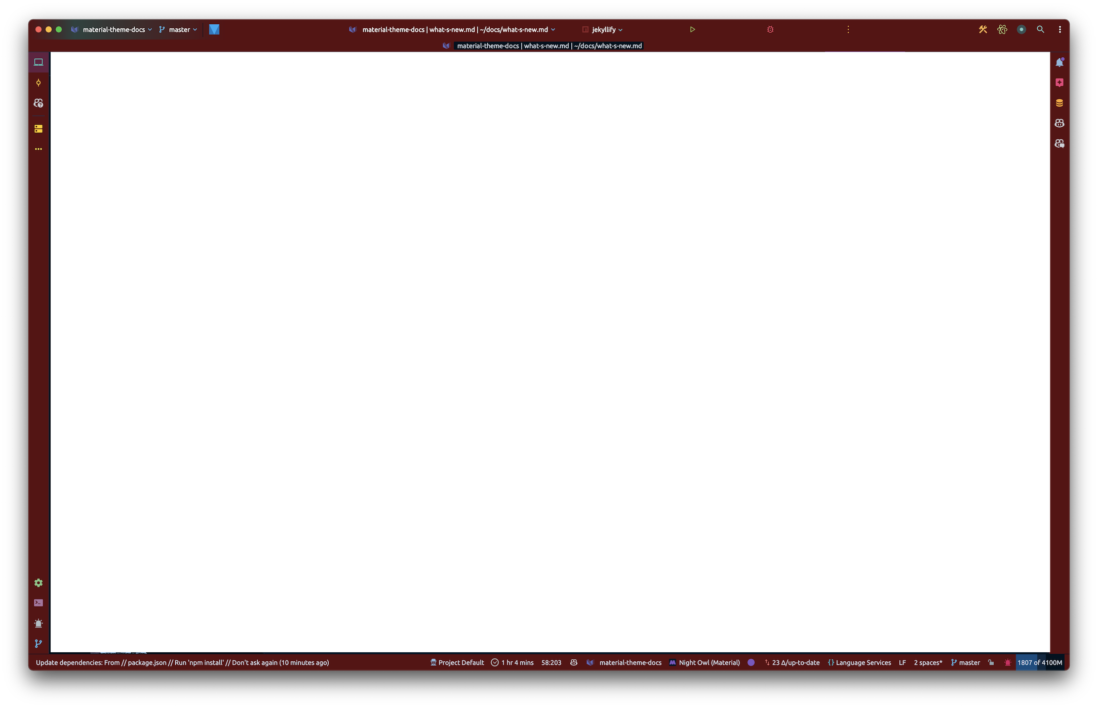
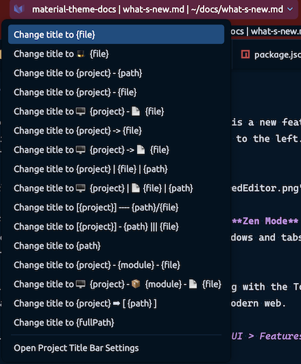
Moreover, a new widget has been added on the Title Bar displaying the same contents of the Project Frame, that you can toggle ON or OFF according to your tastes.
You can also select from a list of presets for your Title Bar widget. Maybe more will be added in the future!
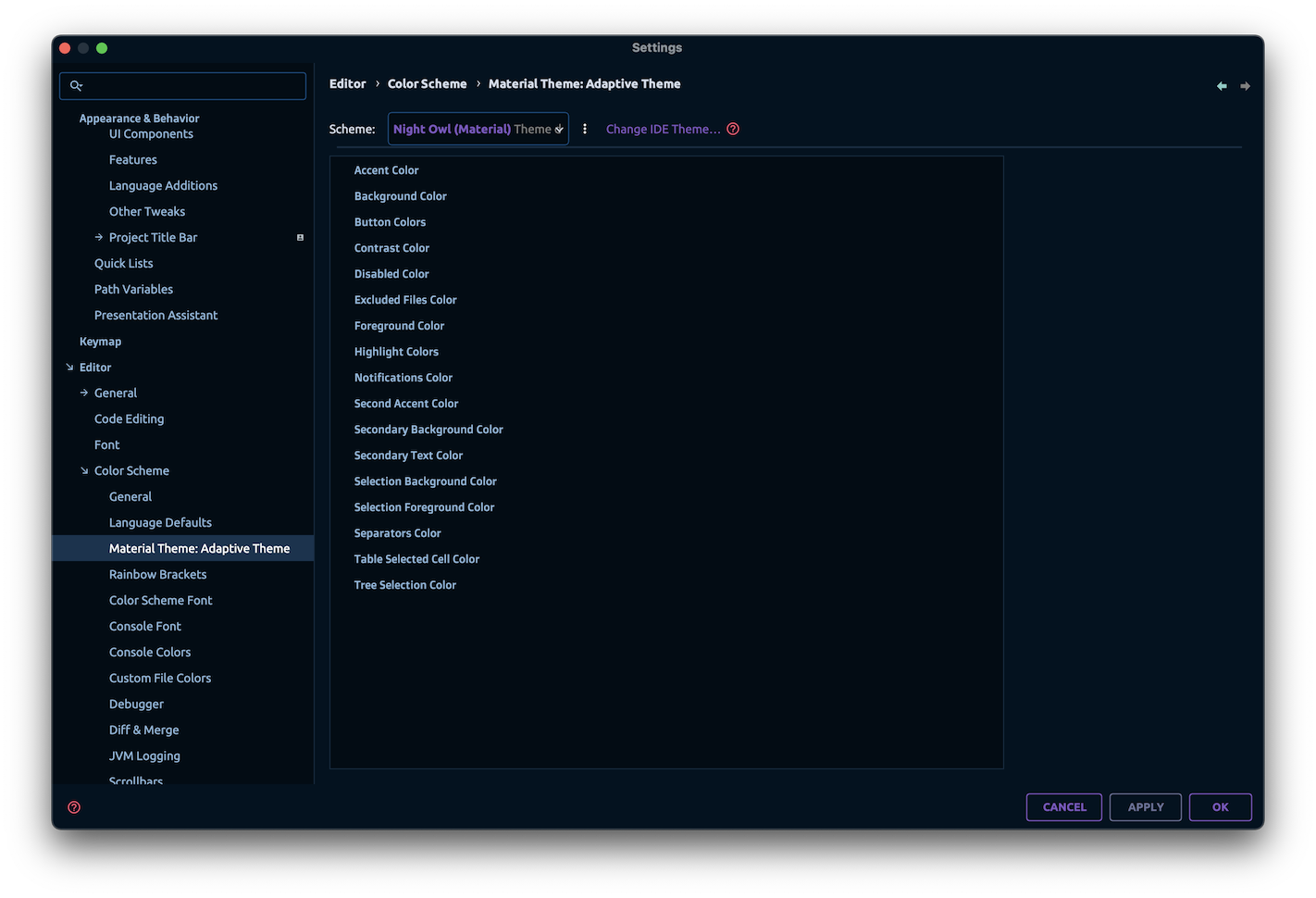
Adaptive Theme
The Adaptive Theme is a new theme that adapts itself from the color scheme. When selecting that theme, it will select the most suited color from the current color scheme as the theme colors.
You can also choose to override the colors you want from the Color Scheme Settings Page.
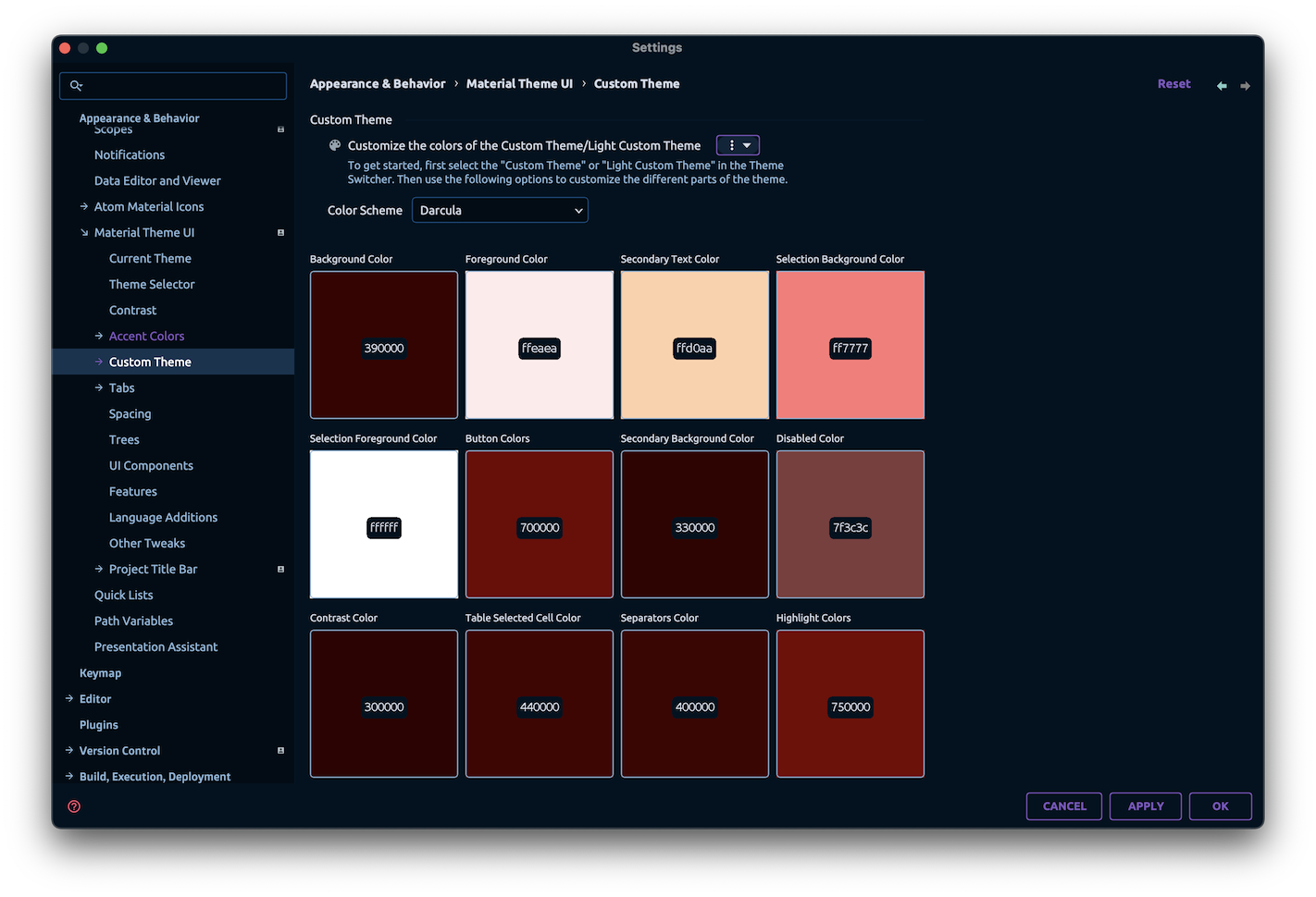
Current Theme and Custom Theme
You can now visualize your current theme colors in the Settings page under Material Theme UI > Current Theme.
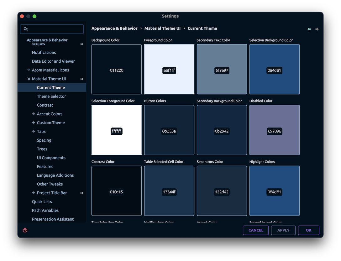
This page displays a matrix of the current theme colors, with the ability to copy the theme colors by clicking on a tile. And yes, this works for non-bundled themes too!
The Custom Theme page has also been migrated to the new layout, with the option to assign a different set of colors for the Light Custom Theme.
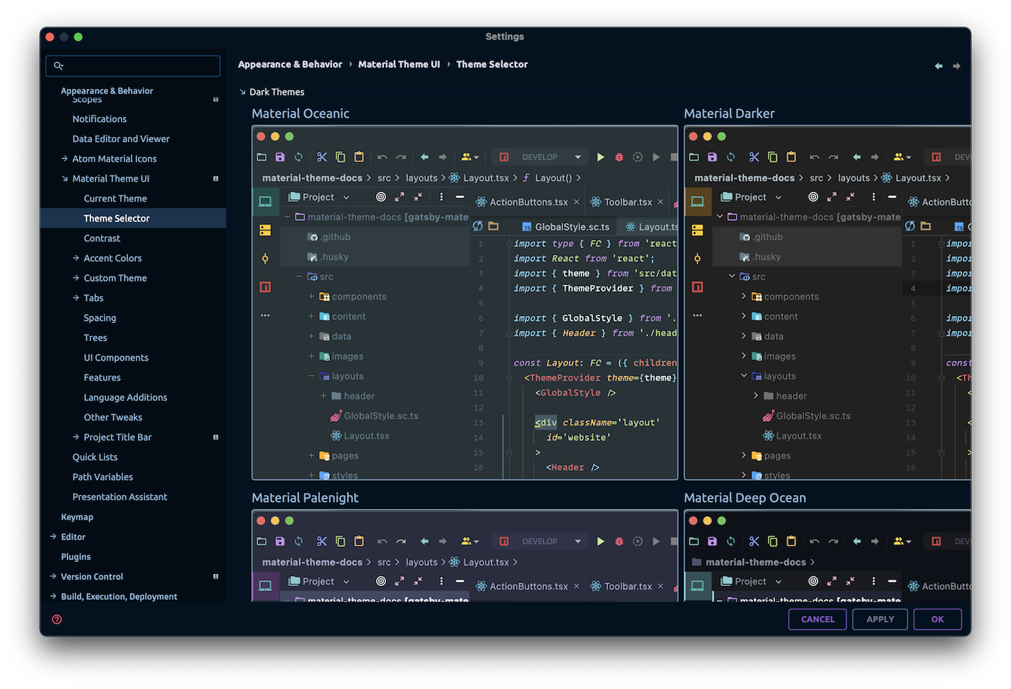
Theme Selector
The Theme Selector, previously only available inside the Wizard, is now available in the settings page as well. You can now preview the themes before applying them.
Note: We are aware of the current performance issues with the Theme Selector, and we are working on it.
Contrast Settings
The contrast settings are available in the Material Theme UI > Contrast page, just like before.
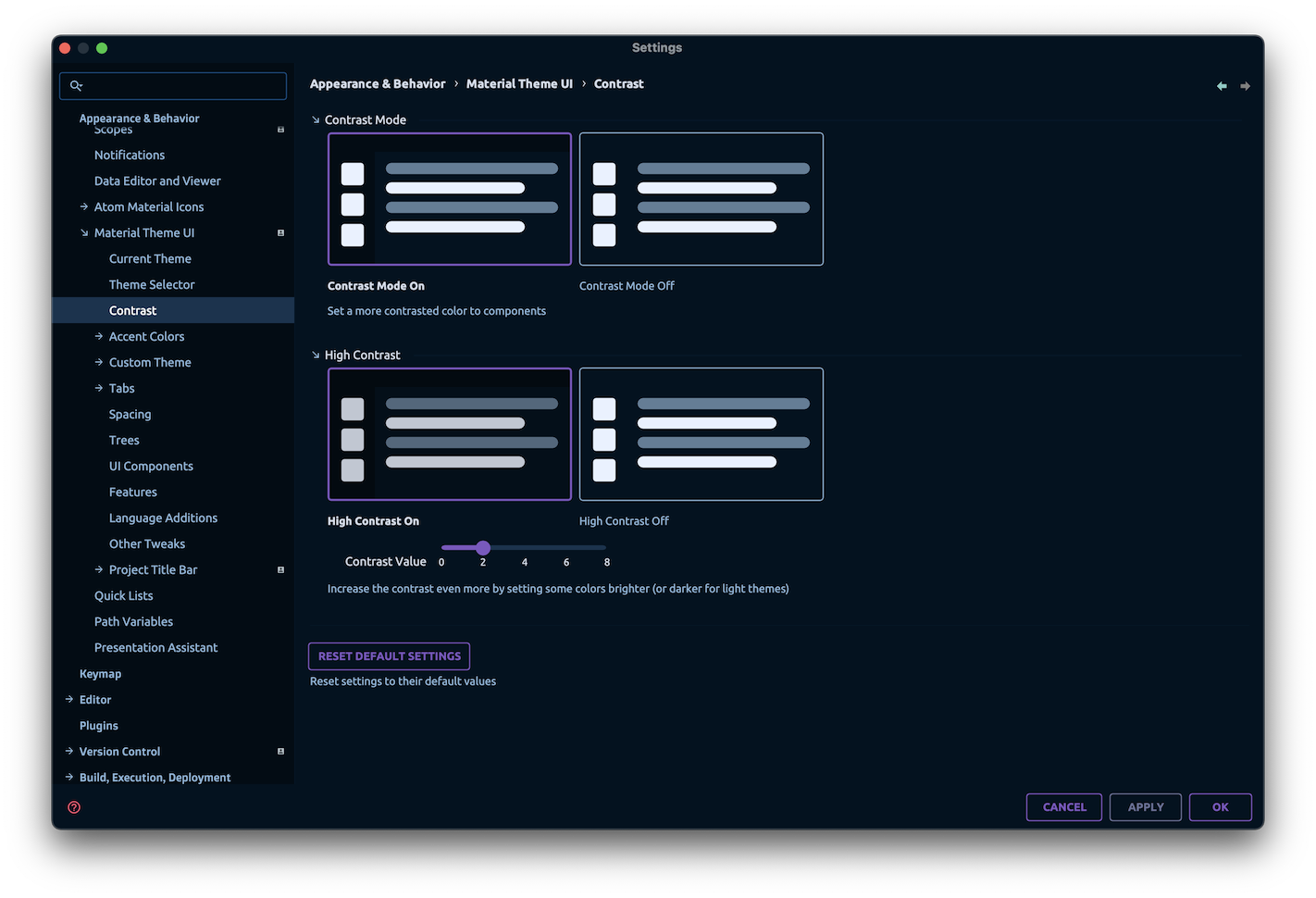
In addition, you can now fine-tune the degree of contrast for the High Contrast mode, by adjusting the Contrast Level slider. (Only available for premium users).
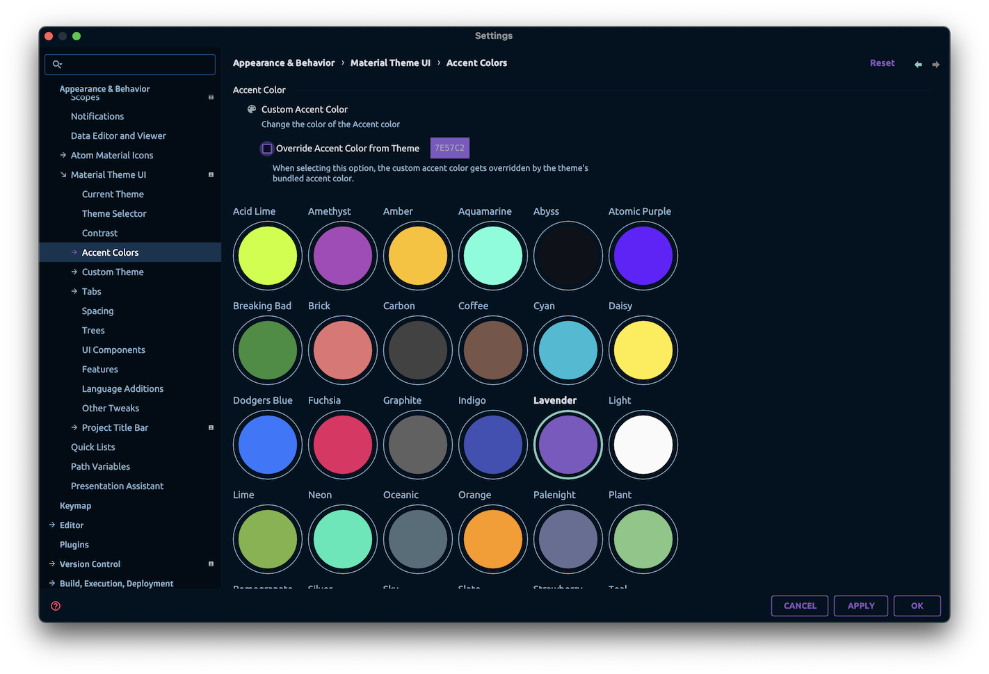
Accent Mode Revamp
Another highlight of that new version is the revamp of the Accent Mode.
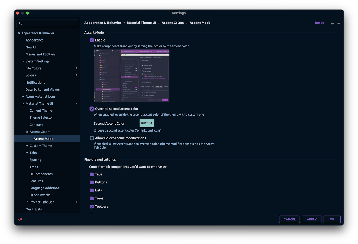
In the new Accent Mode, you will have much more options to control the look of the Accent Mode, such as the ability to add a second Accent Color, or to toggle which parts of the IDE you don’t want to be affected by the Accent Color.
Spacing Settings
Previously labeled “Compact Settings”, the spacing settings have been moved to the Material Theme UI > Spacing page, where you can adjust the spacing of the UI elements.
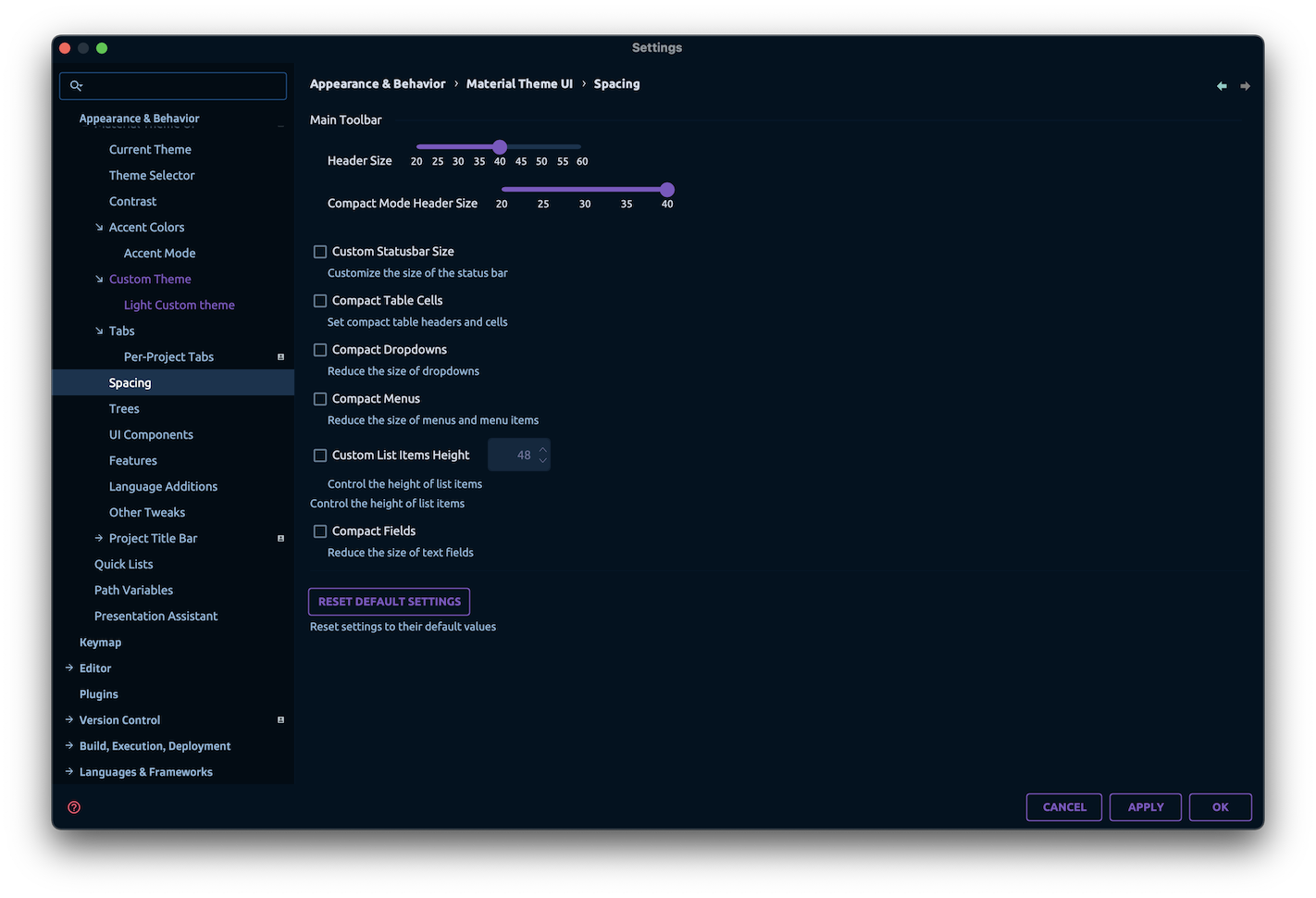
There, you can find the previously available compactness options, as well as two brand new settings: Header Size and Status Bar Size.
Example of a bigger header and status bars:
Note: Increasing the header size also increases the icons size! Maybe in the future we’ll separate the two.
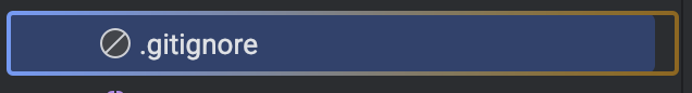
New Project Tree Indicators
New Project Tree Indicators have been added to the list:
Right Border
Underline
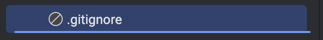
Boxed
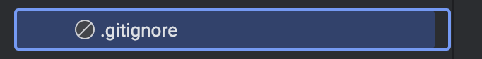
In addition, you can select to have a gradient instead of a solid color for the indicators.
Arrows Style
Previously only available in the Atom Material Icons plugin, you can now find the Arrows Style setting in the Material Theme UI > Trees > Arrows Style page.
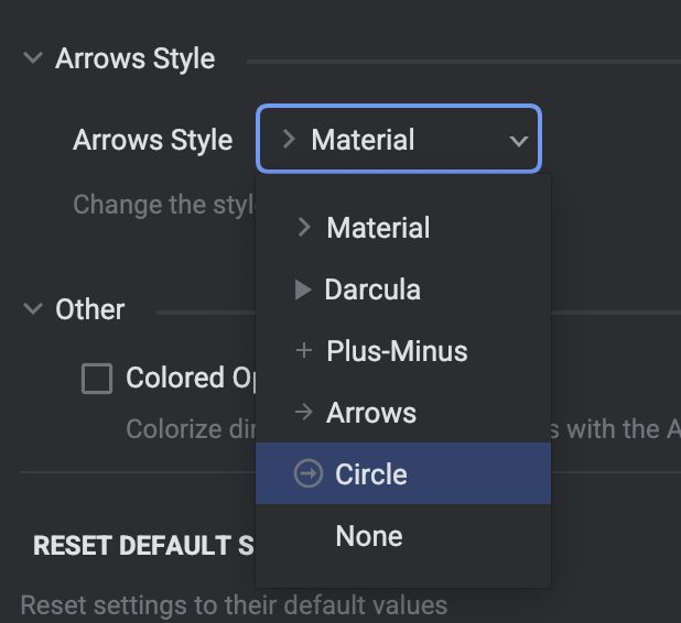
Note: This setting is only available for users NOT using the Atom Material Icons plugin in conjunction with the Material Theme UI plugin.
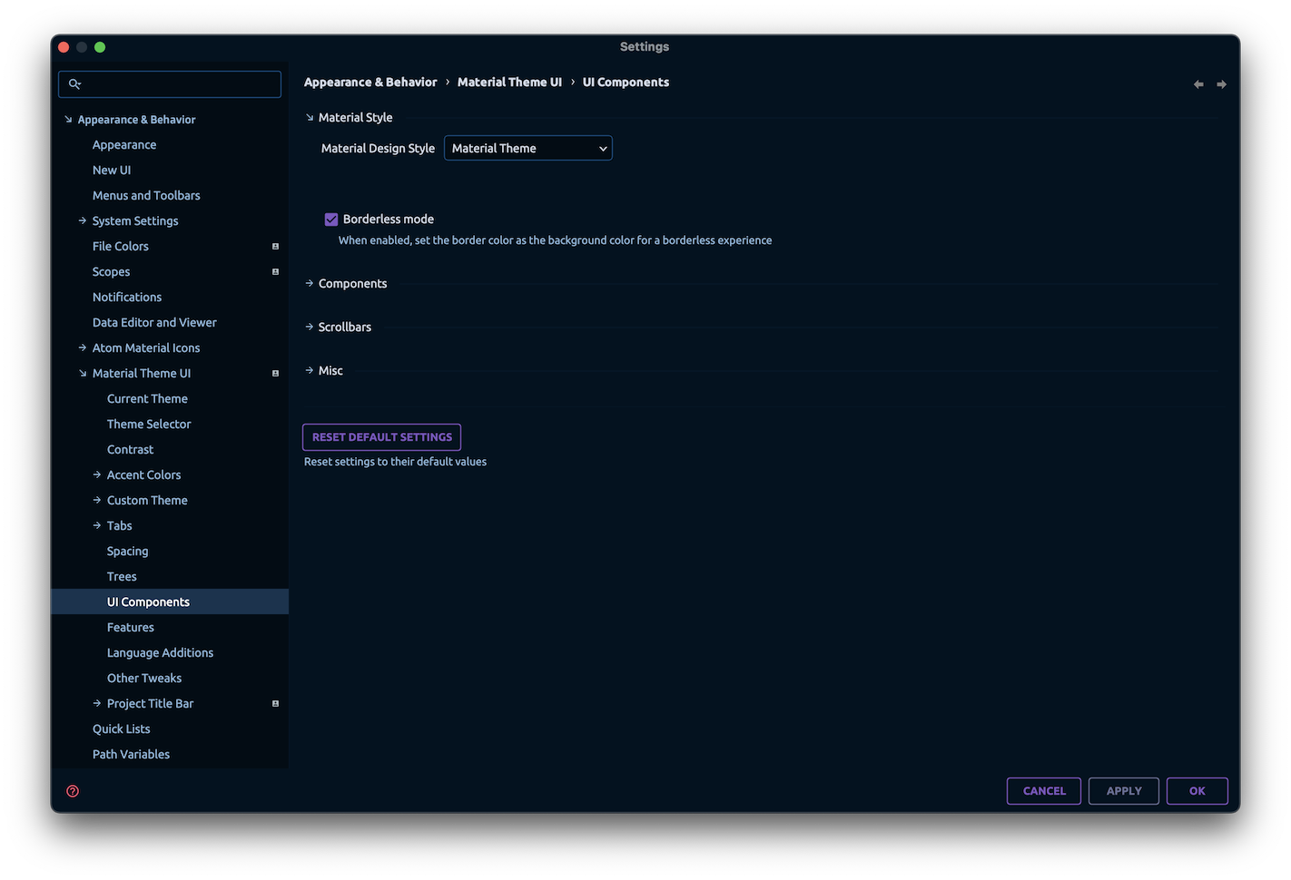
Borderless mode
A new mode is available under Material Theme UI > UI Components > Borderless Mode. When enabled, it sets the “Border Color” to be the same color as the background, effectively “hiding” the borders from the UI components.
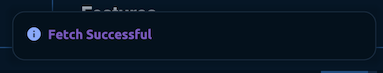
Round Notifications
Still on the UI Components page, you can now make the notifications round by enabling the Round Notifications setting.
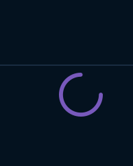
Material Circular Loader
The Material Circular Loader is now available in the settings page under Material Theme UI > UI Components > Material Circular Loader.
When enabled, it restores the previous circular loading icon, just like the one found in the Material Design guidelines.
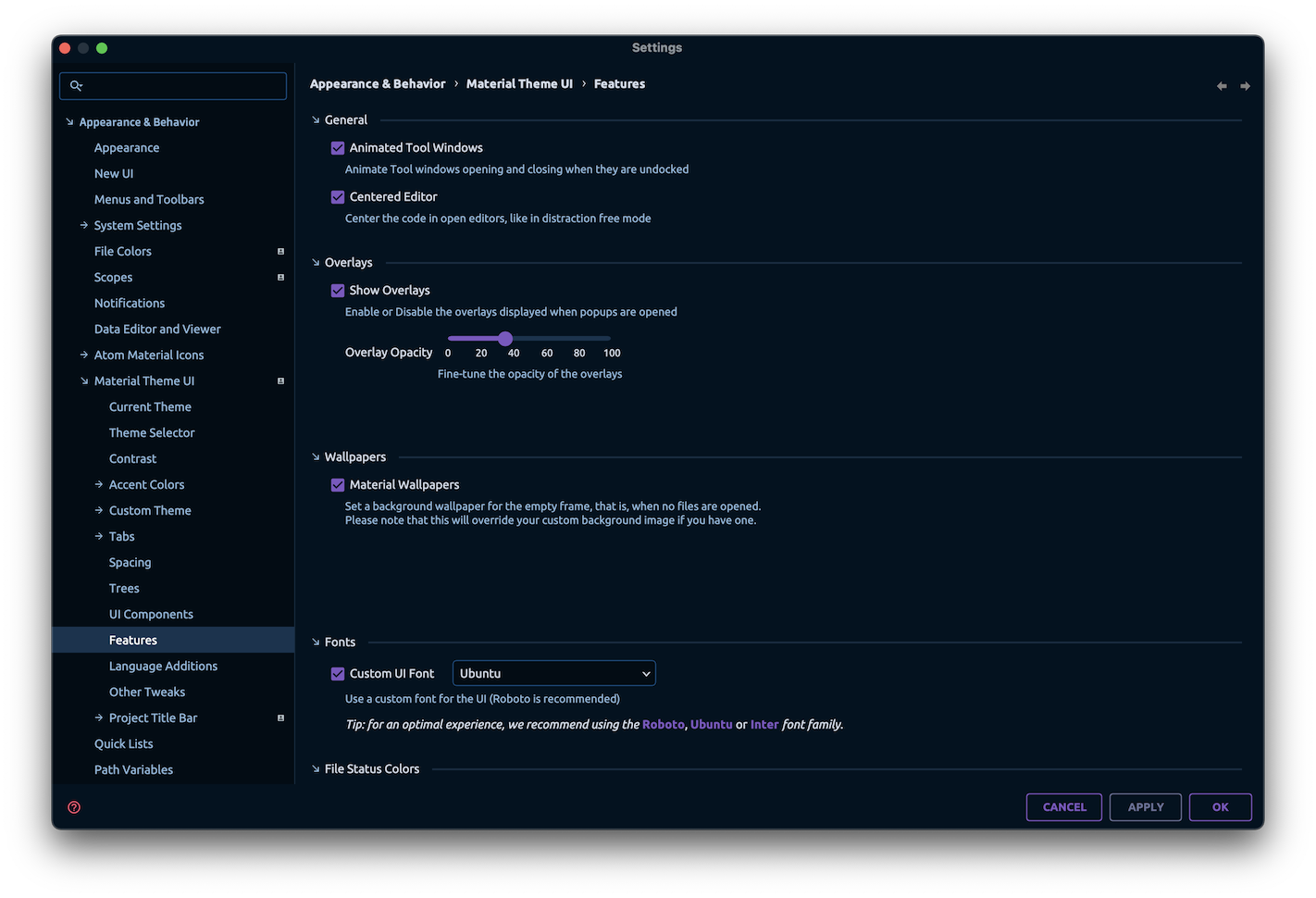
Custom Overlay Transparency
From the Material Theme UI > Features page, alongside the Overlays feature, you can now fine-tune the transparency of the overlays.
Language Additions
The Language Additions now allow you to disable specific languages rather than the whole feature.
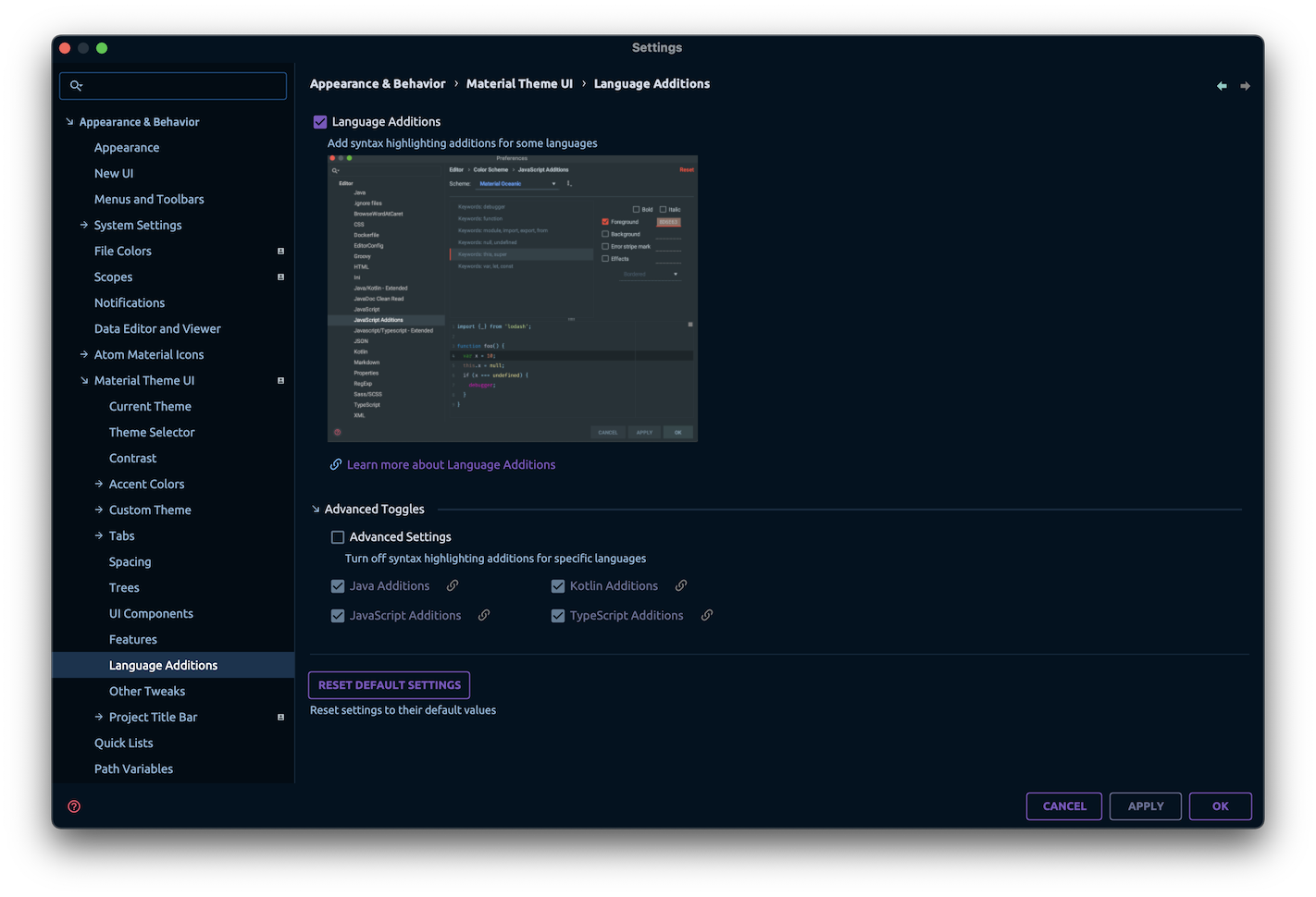
In addition, languages have much more available options than before, with more keywords added to the tray, allowing for more customization. Oh and Rust has been added to the available languages list!
Deprecated Features and Removals
To conclude that long list of changes, there are two features that have been unshipped from the product due to low adoption and maintenance costs:
- Recommended Plugins
- Focus Mode
The Focus Mode have since then been adapted to a separate plugin, but it is currently unmaintained, so be aware that there will probably be no more updates unless someone else takes the reins of the project.
The Recommended Plugins was removed because plugin curation demands time and constant maintenance, and besides it was drafting away from the plugin’s core features.
Fiou, that was a lot. There are also a lot of bug fixes and improvements, as well as other deprecations and removals, but I think I’ve covered the most important ones. You can find more information in the changelog.
Please note that this version is still in its early stages, and bugs and performance issues can still be experienced at this point. But we are working hard to make it better, and we hope you will enjoy the new features!
That’s it, thanks all folks!
- What’s new in Material Theme UI v9.0.0
- New Settings
- Centered Editor
- Project Title Bar
- Adaptive Theme
- Current Theme and Custom Theme
- Theme Selector
- Contrast Settings
- Accent Mode Revamp
- Spacing Settings
- New Project Tree Indicators
- Arrows Style
- Borderless mode
- Round Notifications
- Material Circular Loader
- Custom Overlay Transparency
- Language Additions
- Deprecated Features and Removals