This feature is only available for premium users.
This section explains how you can customize the themes colors using Custom Themes.
Introduction
The Material Theme plugin comes with a set of beautiful prebundled themes, suited for a good development experience. However, not everyone can be content with the choices made by the theme creator, and while the plugin offers a lot of customizations, still, the ability to customize the themes themselves was one of the most requested features.
As of version 0.10.0, the plugin is giving the ability to do so by offering two “boilerplate themes”, Custom Theme and Light Custom Theme, respectively
based on Material Oceanic and Material Lighter, with the ability to customize most of the colors used by the themes!
Configuration
Settings
To use a custom theme, first you’ll need to configure its colors. To do so, open the Settings and navigate to Appearance & Behavior → Material Theme UI → Custom Theme.
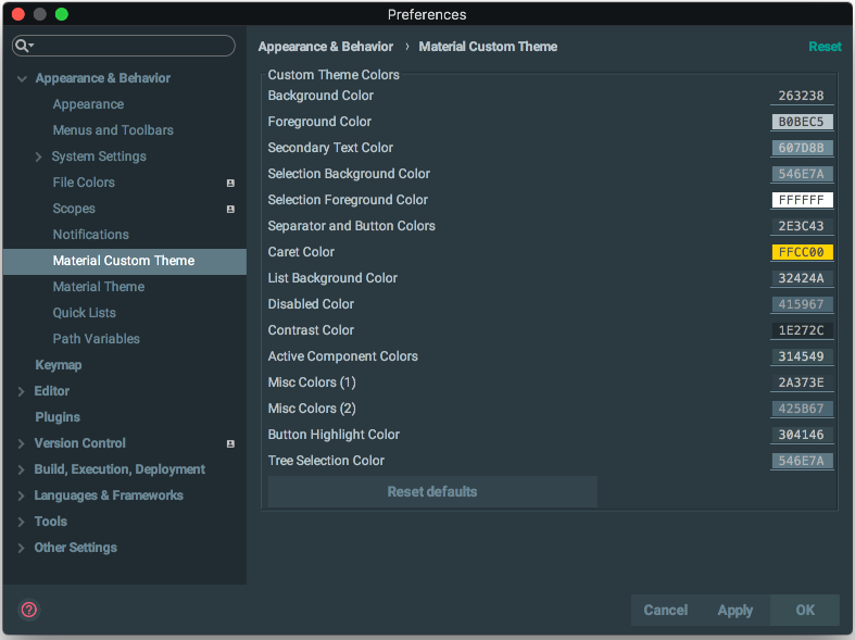
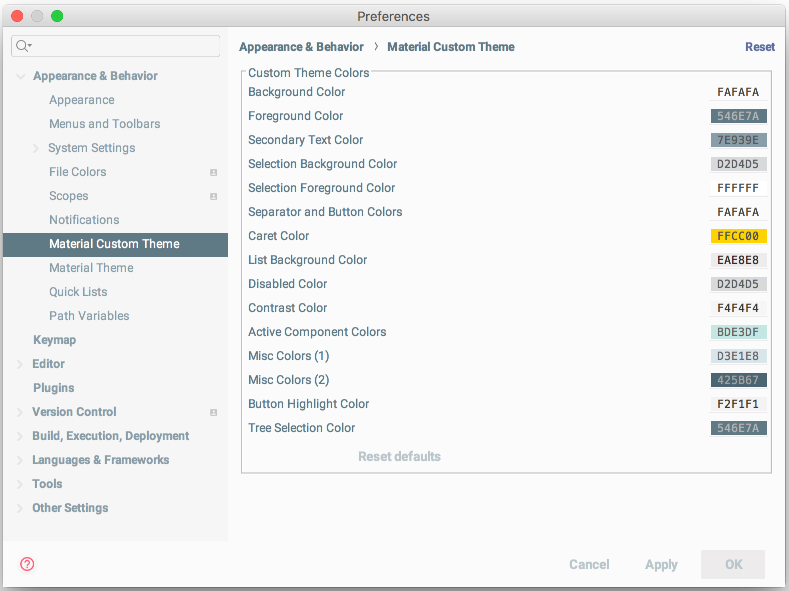
Once you’re done customizing your colors, you’ll need to select Custom Theme or Light Custom Theme from the Theme Switcher to see your colors in action. Enjoy!
Color Scheme
From version 7.5.2 you are now able to select a Color Scheme to assign to your custom theme. This is particularly useful if you have “Custom Color Schemes” or schemes downloaded from the Marketplace, and want to assign them to your custom theme.
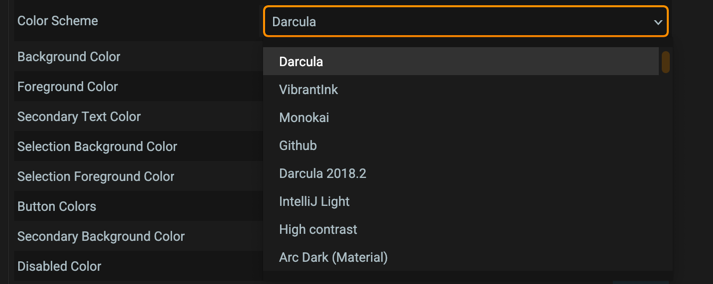
Note: If the color scheme can’t be found (for example, if you decide to use the _@user schemes or if you select a plugin based scheme), it will automatically
revert to Darcula)
Importing and exporting custom themes
From version 3.8.0 a new button has been added to allow you to import colors from external themes into your custom theme.
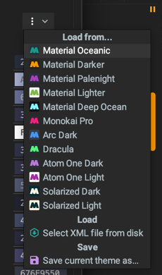
You can set colors from the predefined themes to have a better starting point, or you can import your own theme in the form of an XML file (see External Themes)
Lastly, you can export your current set of colors into your own External Theme so that you can share it or, even better, bundle and release it as a plugin!
Just select Save current theme as… to be presented with a screen to enter your theme details:
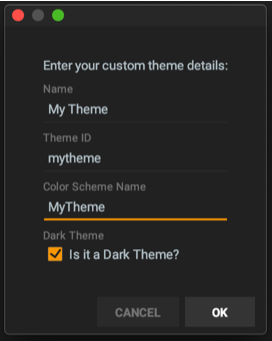
Here you can specify the name of your theme, a unique identifier, whether it’s a dark theme and optionally a color scheme to associate with (useful if you want to write a theme for a color scheme such as the ones found in the plugin repository or from the internet).
From this point, you can distribute it between your IDEs/computers/peers or for all the world to share.
Colors’ explanation
Here’s a non-exhaustive list of all the settings and what components they’re affecting. Please note that this is a non-fixed list, as in every version new components are added, some components are updated, deleted etc…
New: Since version 6.10.0, you can add support for the Material Theme plugin in your native themes’ json using the properties specified in the following section.
Background color
Property: material.background
Affects the main background color of the IDE’s panels, popups, controls…
Foreground color
Property: material.foreground
Affects the main foreground color of the IDE’s panels, popups, controls…
Secondary text color
Property: material.primaryColor
A secondary color used in some controls:
- Buttons Text
- Menu and Menu Items shortcut texts
- Text fields’ border
- Disabled text in dropdowns
- Tree items
- Tag names in VCS Log
- Other helping texts
Selection background color
Property: material.selectionBackground
The background color of selections in controls:
- Menu and Menu Items selected items
- Selected List Items and Table Cells
- Selected tabs
- Autocomplete selected item
- Selected Tab in TabbedPanes
- Selected text in documentation panels
Selection foreground color
Property: material.selectionForeground
The foreground color of selections in controls:
- Menu and Menu Items selected items
- Selected List Items and Table Cells
- Selected tabs
- Autocomplete selected item
- Selected text in text fields
- Selected text in documentation panels
- Focused buttons’ text
- Dropdown selected item text
- Selected item in trees
Buttons color
Property: material.button
Buttons colors and others:
- Buttons background color
- Merge commits text
- Section headers
- More Buttons
Secondary background color
Property: material.second
A secondary color used to contrast with the background color.
- Lists background color
- Active Tool Window Header Color
- Memory Indicator Unused color
- ProgressBar track color
- Autocomplete popup background
- Parameter info popup background
- VCS Log’s current branch background color
Disabled color
Property: material.disabled
A color used principally inside disabled items:
- Disabled menus and menu items’ text
- Disabled text fields and password fields
- Disabled buttons
- Disabled checkboxes
- Disabled tabs
- Disabled items in Parameter info
Contrast color
Property: material.contrast
The color used when contrast mode is enabled:
- Contrast mode-affected controls (Tree, Text fields, Tabs…)
- Odd rows in striped tables
- Documentation panes
- Tool Window Headers selected tab
- Selected Tab in Tabbed Panes
- Search Everywhere search field
- Selected ToolWindow
- Editor background when no opened files
Selected text color
Property: material.active
Another color to use for selected texts/active component colors:
- Selected cells in tables
- Selected text in text fields and documentation panes
- Selected items in dropdowns
- Primary Buttons and Hovered buttons
- Hovered Tool Window buttons
- Active Tab in Tabbed Panes
Border Color
Property: material.border
Color affecting the following components:
- Menu bar border
- Disabled checkbox box color
- Button borders for non-material buttons
- Tabbed Panes border
- One Pixel Separators separating editors in Split Mode
- Menu Separators
- Help Tooltips border
- Welcome Screen Separator Color
- List Separators
Highlight color
Property: material.highlight
Color affecting the following components:
- Text fields and dropdowns border
- Checkboxes’ sign in disabled checkboxes
- Memory indicator’s used memory color
- Unfocused item in some lists
- Hovered tab in tabbed panes
- Selected Tab in Search Everywhere
- Active debugger tab
Tree selection color
Property: material.tree
Specific color used for selected items in trees and autocompletion lists.
Notifications color
Property: material.notifications
Color used in the notification popups.
Accent Color
Property: material.accent
This is the color replacing the Accent Color if the Override Accent color from theme setting is set.
Excluded files’ color
Property: material.excluded
This is the color added in the File Colors’ Settings, named “Theme”.
Frequently Asked Questions
Q: Can I use more than one custom theme?
A: No, you can’t. But if you’re confident with your theme, you can decide to publish your theme with the aforementioned properties, so that it would be caught by the plugin, or save the XML file so that you can export it and use it wherever you want.
Q: Where are stored my custom theme settings?
A: You can find your custom colors inside
the config directory
, just like the Material settings, with the filename material_custom_theme.xml.
Q: I changed the colors, but it doesn’t look as good as the default themes.
A: Creating a theme isn’t an easy task, and the Material ones are the result of a long-thought process about which colors are best suited for a UI. However, you can check out other famous Sublime/Atom/Visual Studio themes as an inspiration and start from it.
Q: OK I have an idea of a theme, but there aren’t enough options in the settings for me to make it.
A: It’s true that those settings are for color palettes of a few colors only, and regroup components of the same purpose under the same color group. However, if you’d like to have a different color for checkboxes and radio buttons, or between lists and tables, or set the tree color different as the main background color, etc. — for you have multiple options. You can simply use the JetBrains Theme API to create a custom theme, or for the more advanced developers, create a brand-new plugin based off the Material Theme SDK, like the Doki Doki Literature Club Theme, or the Night Owl Theme.
Q: I set the color scheme via the Editor > Color Scheme options, but it resets every time I restart the IDE!
A: If you’re using a Custom Theme, that might be due to the Color Scheme option. Make sure to specify the color scheme you want to use to this screen as well.