This is a reference of all the components customized by the plugin.
Note: This page concerns the old Material Design, which was the style from 2015 to 2022. Since then, the UI has been redesigned to comply to the new Material Design guidelines.
Introduction
The original idea of the Material Theme plugin was to be able to customize the UI and Editor colors to look like the original Sublime theme. Since there wasn’t a way to create a new separate Look And Feel, the plugin is borrowing the native Look and feels, Darcula and IntelliJ, and overrides their colors as long as it’s able to.
However, the plugin didn’t stop there. Aside from changing the colors of the editor, the theme also got to customize the different parts of the editor with a Material Design look and feel, which brought him a lot of stars. There should be a way to do it for JetBrains IDE as well, right?
And there is one, and thus the plugin features Material Design components reworked from the ground up, making it look similar to the original plugin, and even bringing new features to light!
Reference
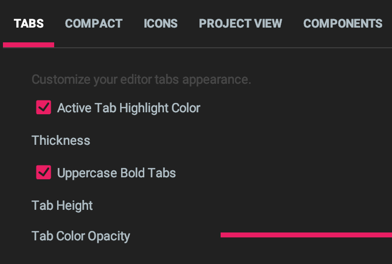
Tabs
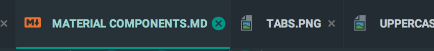
Regular Editor tabs have been modified to look like Material design tabs:
- They got bigger.
- An indicator is displayed under the active tab.
- They can be bold and uppercase.
- The close button has been reworked.
- A shadow is shown under the tab strip.
Buttons
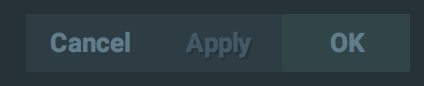
- Buttons have been flattened and lost their bevel effect.
- The font has increased to 13px and became bold.
- An animation is played when hovering them as they change color.
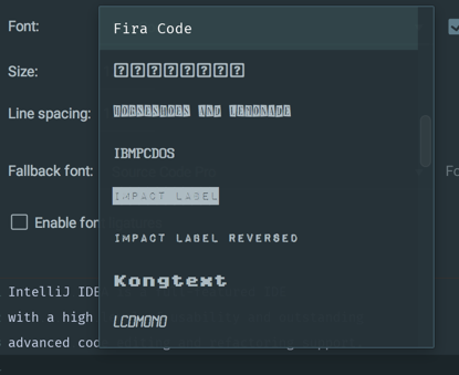
Inputs, numbers and passwords
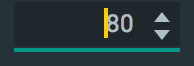

- They display a rounded border, which gets highlighted on focus.
- They have a different background color in contrast mode.
- Password fields have a new button to allow previewing the inputted characters.
Checkboxes

- Checkboxes are now filled with the accent color while the sign is transparent.
- They get some sort of halo when checked/unchecked.
Radio buttons
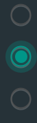
- Radio buttons got similar to the Material Design Radio buttons.
- They get some sort of halo when pressed.
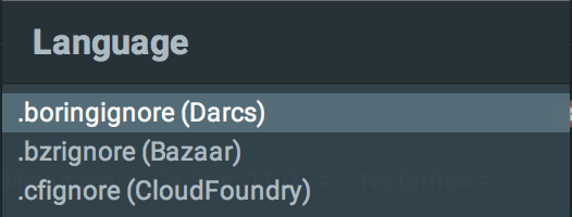
Dropdowns/comboboxes
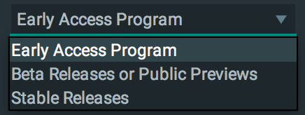
- The dropdowns/comboboxes got redesigned by having the same border as the inputs, which highlights on active/hover.
- Besides, they have been added more padding between items, as well as hovering over the selector, just like Material
Design dropdowns.
This behavior can be switched off via the
Compact Dropdownssetting.
Action buttons
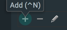
- Action Buttons, or Toolbar buttons got redesigned to display some sort of halo when hovered/pressed.
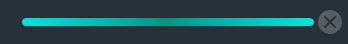
Sliders
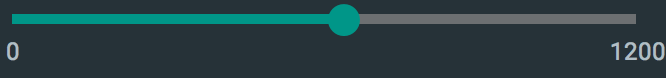
- The thumb got round and larger.
- The track got thicked and received the accent color.
- The steppers have been removed.
Tables
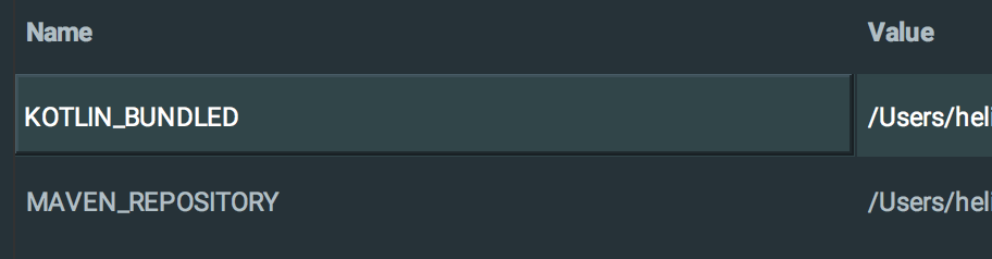
- Table Headers and cells have been padded on top and bottom.
- Table Headers got bold.
- Table Cells got a beveled border when selected.
- Striped table rows get the regular and contrast color of the current theme.
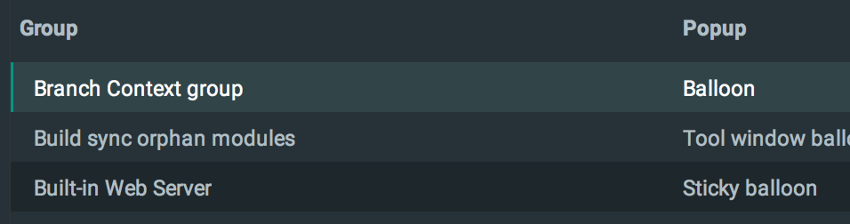
Trees
- Tree Items height got bigger (can be customized in the settings)
- The selected item is highlighted with an indicator (can be customized in the settings)
Progress indicators
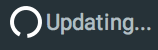
- Progress Bars have lost their “striped” look to look more like a regular filling bar.
- Progress Loaders have been replaced with the well-known Material Design circular loader.
Dialogs
- Dialogs title bar’s text is now left aligned, bigger and bold.
Switches
- On/Off buttons that appear inside the Command Panel and Search Everywhere.
Navigation bar

- The Navigation Bar at the top of the view looks more like Material Design breadcrumbs.
Tabbed Panes
- Tabbed panes respect the Tab Settings, thus allowing custom height, custom indicator and upper case labels.